A wall slightly cracked, A snail locked inside by a rock. Have the rock been placed by hand ? Is the snail alive ? The photo is a monochrome and white to play with to play with the viewer's perception.
Well, the above photo was not generated by artificial intelligence.
Although it could have been ! After reading this line you might look at it again wondering if it actually has ?
I won't give you the straight answer: because in any case, the the point if a good framing (or art, if we shift the debate) is to make you think about how to bend perspectives and hold a viewer's attention.
“The composition serves a purpose, it is an adequacy between the visible and the invisible.
In general a good photo is well understood, it has meaning, it transmits a message.”
“To reach the subject, it is better to know it.”
“A failed photo does not achieve its objective, but if the objective is to make a failed photo,
then the objective is achieved.”
“The composition leads to the subject if there is a position in relation to the subject.”
This article was inspired from notes taken at spring 2017's Antonin Amy-Menichetti wokshop from lesphotographes.org, above quotes originated from him.
Composition and shooting
Principles that follow are notions anybody can use to better understand and improve the way one's is choosing to compose with a camera.
Format
Human perception works with symbols such as the alphabet. Symbols need a medium to be used. Thus the rectangular shape of the photos is due to the ease of transmitting and to share images with this type of format.
However, it is hardly inconceivable to imagine a photo on a square or square or circular support although more difficult to implement.
The current aspect of the photographs is proportionally derived from that of the original 35mm film in the early days of photography.
24/36 : reportage
6/7 : stifling
Square : fun
16/9 : film
Rule of thirds
This rule consists in dividing the image into thirds, it is used roughly for a pleasant rendering.
The space of each insert is used so that the information presented is the least redundant possible.
Contrast
The contrast marks the differences, it attracts the eye:
- color: opposition on the color wheel (orange / blue, green / red).
- black and white: difference between the darkest point and the lightest point
- spatial: elements opposed by their position in space
- meaning: a contrast of meaning can mark the opposition order / chaos, joy / sadness
Proximity
The reserve of meaning maintains attention
Guess which one of the two sentences below are corresponding to the above quote from Antonin ?
- When the object (eg a character) of the photo is not the subject (a message), such as a flower
- When the object (e.g. a character) in the photo is not the subject (a message), such as a beautiful flower in full bloom amidst faded flower
In the second sentence, we can see how placing subjects can play with the contrast of meaning.
The further the object is from the subject, the more interesting (intriguing) the photo is.
In other words, when the message of the image pushes to think, there is an added value that maintains the attention.
Proportions / Proximity
Depending on the framing, we can give a sense of proximity or distance to the image.
For the same scene with a wider angle, depending on the visible elements, the meaning can change.
Levels and curves adjustments in sunset backlight condition
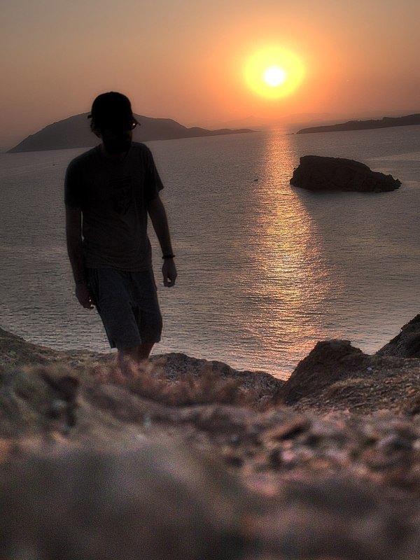

By experimenting with and changing a shot range / angle, a feeling of isolation can turn into grouping, or a group of tourists can reveal one man in isolation, such as in the above composition (on a side note, the sun is also appearing smaller in the distance, but is revealed in all its magnitude by some astrophotographers, same goes with the moon).
Arm length
The arm length corresponds to our comfort zone (defense zone, proxemic bubble). By moving close to the subject to take a picture, we share his intimacy. For a portrait, this effect can be simulated by keeping only the part of the face between the forehead and chin.
Our eye is trained by the reading to browse the frames from left to right. We can thus make message of the "before/after" type by arranging the elements horizontally one after the other.
Geometry
Elements of geometry are used to give an appealing look to the composition.
- Leakage lines give perspective to the image.
- The tilt of the lens modifies the horizon and the perspective: see from above, below.
- A pyramidal shape seems aggressive but becomes warm when inverted.
Verticality : just an object (transition, isolation, proximity)
Horizontality : the object in its environment (immensity, grouping)
Conclusion
What to avoid
- Unused spaces, empty elements
- Discontinuities of elements through the frame (arms, tree branches)
- Overlapping elements
Steps to follow
- Define a subject
- Fill in the image
- Compose to capture the subject
- Search for harmony, aesthetics
- Control the frame edges.
This photo was too dark ? See how it is brighten in under 2 minutes !
In one simple step, visualize how this photo was fixed although it was too dark (underexposed). This showcases the result achieved with not even a RAW file but a JPEG.
When you underexpose a photo, you maybe think it is lost, and it can be cumbersome to find a straightforward fix to correct it in no time ! Easily learn how to fix your photos with this tutorial about a tool named levels.
Learning about exposure adjustment with levels tools will help you take the most rewarding stride into photography with less hassle by stepping up to the next level.